Santander Global

Santander Global

Santander Global

Case study

About Santander Global.

About Santander Global.

In collaboration with Santarder, we created and designed an Online Banking experience that is accessible and intuitive for users, agile and practical, with the absolute goal of simplifying usability and provide effective solutions.

With this approach, UX/UI Design strategies were proposed for the Santander Online Banking application and website, with decisions made through the insights received from users and their experience on the platforms.

In collaboration with Santarder, we created and designed an Online Banking experience that is accessible and intuitive for users, agile and practical, with the absolute goal of simplifying usability and provide effective solutions.

With this approach, UX/UI Design strategies were proposed for the Santander Online Banking application and website, with decisions made through the insights received from users and their experience on the platforms.

Project goals

Project goals

Knowing in depth the voice of the company and each stakeholder, allows us to design precise strategies and achieve the desired objectives. In this context the goal is to bring users new ways to acquire the items they want with different payment methods that could help to afford them.
We have developed UX/UI Design strategies for the Santander Online Banking application and website, based on the insights we receive from users and their experience on the platforms.

Knowing in depth the voice of the company and each stakeholder, allows us to design precise strategies and achieve the desired objectives. In this context the goal is to bring users new ways to acquire the items they want with different payment methods that could help to afford them.
We have developed UX/UI Design strategies for the Santander Online Banking application and website, based on the insights we receive from users and their experience on the platforms.

The construction

The construction

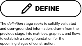
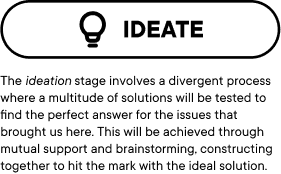
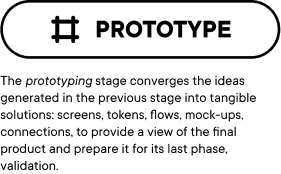
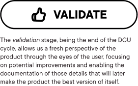
For this project we used a methodology normally referred as the ‘double diamond’ but with some adjustments related to the project needs like the relevance of the prototyping stage and the evolution of the navigation and design elements to integrate this new functionality to their respective pages.

For this project we used a methodology normally referred as the ‘double diamond’ but with some adjustments related to the project needs like the relevance of the prototyping stage and the evolution of the navigation and design elements to integrate this new functionality to their respective pages.

Business information

Business information

Related areas:
* UX/UI Design
* Project management & Delivery management

Related areas:
* UX/UI Design
* Project management & Delivery management

The process

The process

Given the breadth of users and their respective needs that this product must cover, one of our most important tools is to empathize with the user and understand their needs. In this way, the main challenge was to find the ideal pieces and organization for any type of user, promoting an intuitive product, easy to navigate and with the necessary instructions so that any user can easily guide themselves through it.

Three main relevancies stand out:
- The visual hierarchy: Focus was placed on the elements that help visibility, findability and order within a user interface.
- Accessibility: Reinforcing the previous point, easier navigation menus were created to facilitate access to various sections.
- The interface as a guide: The messages, elements and organization, together with the previous points, help guide the user regardless of the level of experience they have within the product so far.

Although the most conventional design stages were used to monitor this project (empathize - define - ideate - prototype), we will focus more on the points mentioned in the previous section and how they led us to the result obtained.

Given the breadth of users and their respective needs that this product must cover, one of our most important tools is to empathize with the user and understand their needs. In this way, the main challenge was to find the ideal pieces and organization for any type of user, promoting an intuitive product, easy to navigate and with the necessary instructions so that any user can easily guide themselves through it.

Three main relevancies stand out:
- The visual hierarchy: Focus was placed on the elements that help visibility, findability and order within a user interface.
- Accessibility: Reinforcing the previous point, easier navigation menus were created to facilitate access to various sections.
- The interface as a guide: The messages, elements and organization, together with the previous points, help guide the user regardless of the level of experience they have within the product so far.

Although the most conventional design stages were used to monitor this project (empathize - define - ideate - prototype), we will focus more on the points mentioned in the previous section and how they led us to the result obtained.
Visual Hierarchy

Visual Hierarchy

Visual Hierarchy

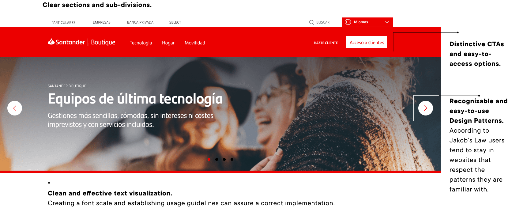
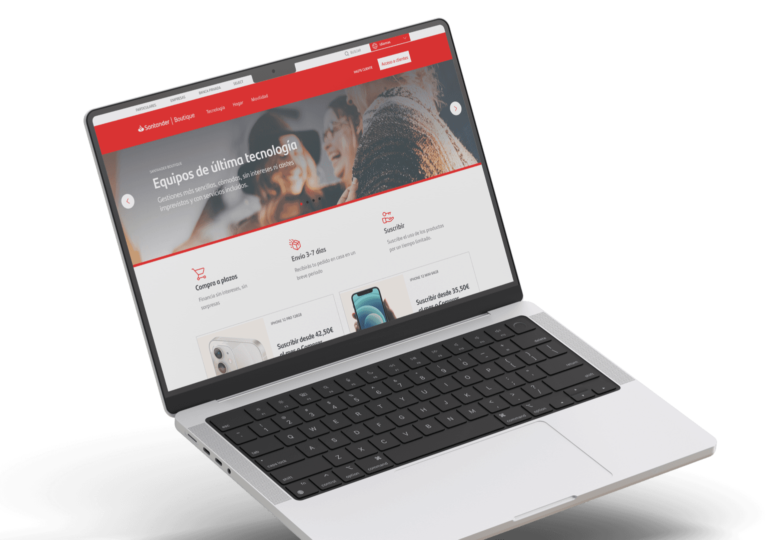
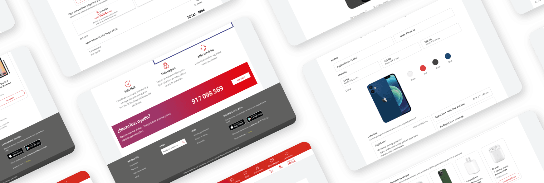
A good design prioritizes that users understand what is important information easily and quickly with a first reading, without much effort on their part. This is specially important when the site resembles -or is used as- an e-commerce, where the patterns are pretty integrated in the user’s memory and navigation.

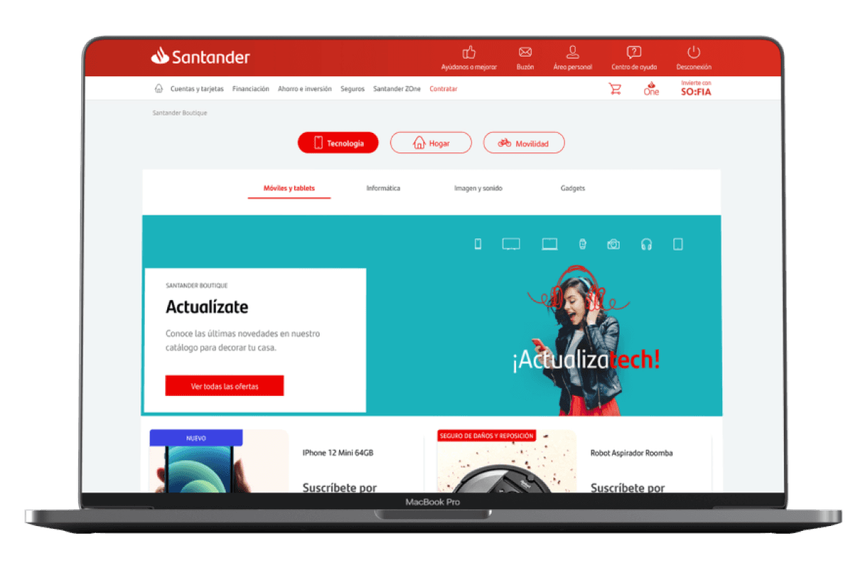
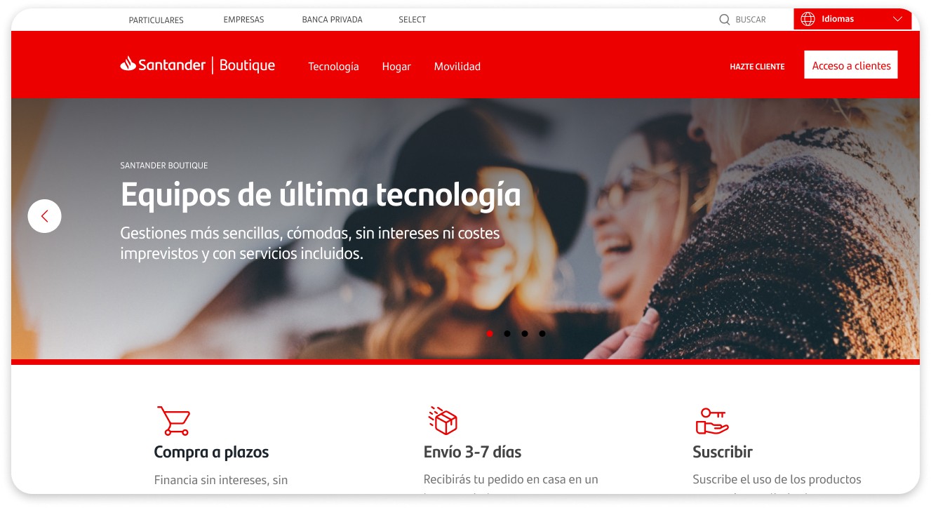
Red is the color that identifies and characterizes Santander. It is also a pregnant color that invites action. We decided that only the Call to action on each screen should be highlighted in red. Thus, users find and distinguish each CTA without problems, in an agile way, and associate it with future CTAs in the next screens.

A good design prioritizes that users understand what is important information easily and quickly with a first reading, without much effort on their part. This is specially important when the site resembles -or is used as- an e-commerce, where the patterns are pretty integrated in the user’s memory and navigation.

Red is the color that identifies and characterizes Santander. It is also a pregnant color that invites action. We decided that only the Call to action on each screen should be highlighted in red. Thus, users find and distinguish each CTA without problems, in an agile way, and associate it with future CTAs in the next screens.

Accesibility

Accesibility

Accesibility

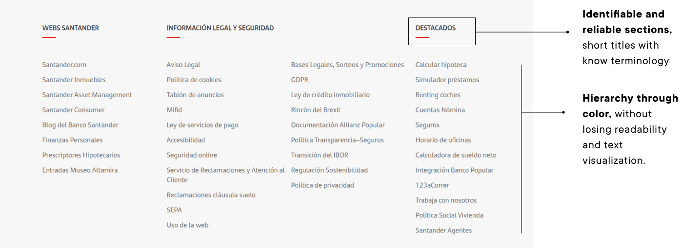
To make the interface intuitive and accessible, we created simple menus, with no more than six main sections.

Simple menus don't mean they lack important information. We carry out a preliminary research work, to rank the data and delimit each of the sections and their corresponding sub-categories.

To make the interface intuitive and accessible, we created simple menus, with no more than six main sections.

Simple menus don't mean they lack important information. We carry out a preliminary research work, to rank the data and delimit each of the sections and their corresponding sub-categories.

Technical aspects to keep in mind:

Technical aspects to keep in mind:

Technical aspects to keep in mind:

  • The advantages of the web: Being a website the diagram and implementation can not only be quicker but also rely on many accessibility tools, both into the code and licked through external plugins.

  • Familiarity and modernity: When contemplating a redesign it’s important not only to keep in mind all the new additions the site can get but also what elements are still usable, what make the product what it is and what makes the brand what it is an what reflects on the site itself.

Visual Hierarchy

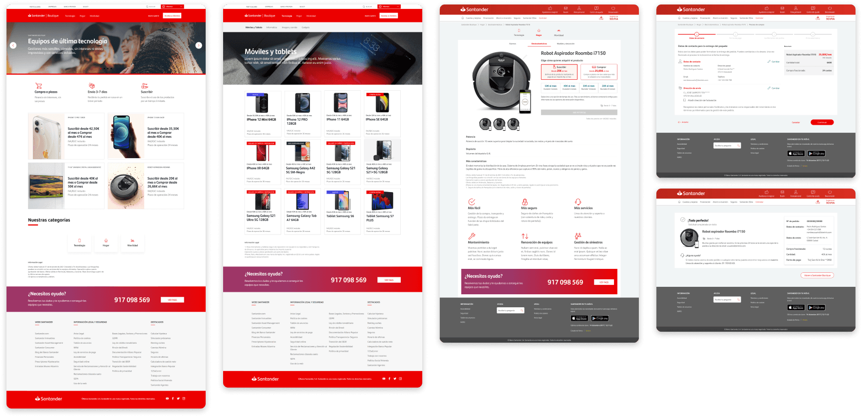
For an interface to make the user experience easier and faster, it is important to know when to offer help or advice. Do you need extra information on this screen? Are the steps you need to take to meet your goal clear?

Under this premise, we design interfaces with the following characteristics:

  • Stepper guide when uploading data may take a few minutes.

  • Easy information selection and switch to change buying preferences.

  • Allow multiple ways of payment to speed up the processes and allow for more sales at the same time that opening more diversity in offers.

  • Indicate clear instructions and navigation in all pages, keeping the site consistency and clarity throwout.

Visual Hierarchy

Visual Hierarchy

For an interface to make the user experience easier and faster, it is important to know when to offer help or advice. Do you need extra information on this screen? Are the steps you need to take to meet your goal clear?

Under this premise, we design interfaces with the following characteristics:

For an interface to make the user experience easier and faster, it is important to know when to offer help or advice. Do you need extra information on this screen? Are the steps you need to take to meet your goal clear?

Under this premise, we design interfaces with the following characteristics:

  • Stepper guide when uploading data may take a few minutes.

  • Easy information selection and switch to change buying preferences.

  • Allow multiple ways of payment to speed up the processes and allow for more sales at the same time that opening more diversity in offers.

  • Indicate clear instructions and navigation in all pages, keeping the site consistency and clarity throwout.

The Visual Language

The Visual Language

The Visual Language

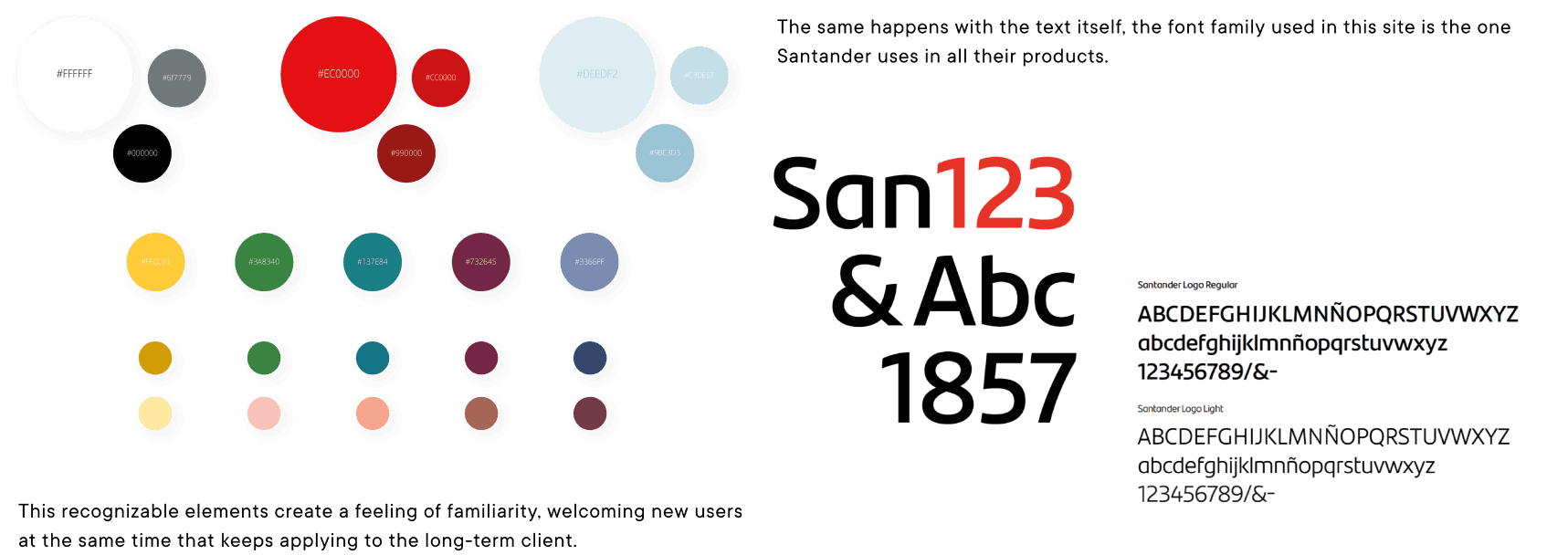
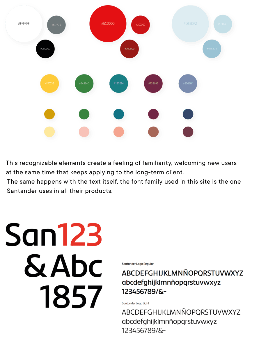
While working with any product it is essential to always keep the identity characteristics present and how these are perceived at the same time in the visual language of the brand, for this the following were taken into consideration: Use of color, typography, iconography and especially the use of pictograms to nourish the design system with clear information.

Accessibility

Accessibility

Accessibility

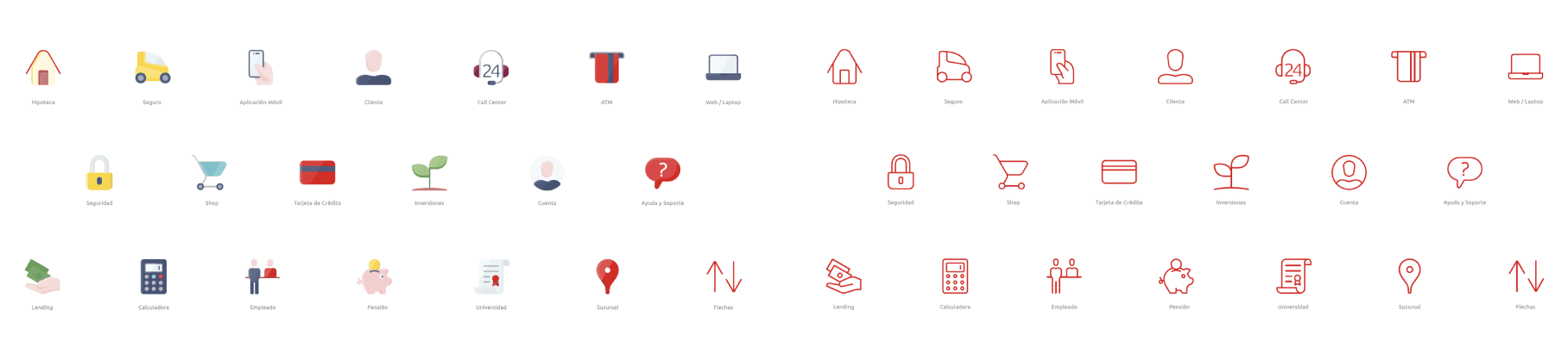
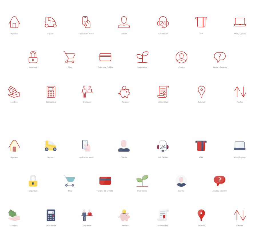
From the evolution of visual identity and style of Santander, the need has arisen to develop its own style of pictograms.
It must be simple, friendly, functional and modern, recognizable instantly on every interaction by part of the various audiences.

Color and recognition

Color and recognition

Color and recognition

In any interface the use of color is not only related to the brand but also to the contrast for data visualization, as explained in the Web Accessibility Guidelines. With the goal of a more approachable and easily navigable site al color combinations were heavily analyzed and revisited in order to create a reliable and justified system that contemplates visibility an easy access to the text while still being recognized as part of Santander’s identity.

The conclusion

The conclusion

The conclusion

We add value to Santander's Online Banking, providing a satisfactory experience to users through an interface that streamlines processes and optimizes company results.

Do you want to create a complete and innovative experience?

Do you want to create a complete and innovative experience?

We're here to help you achieve it

We're here to help you achieve it

Barcelona - New York - Buenos Aires

Barcelona - New York - Buenos Aires

Do you want to create a complete and innovative experience?

We're here to help you achieve it

Barcelona - New York - Buenos Aires