Case study
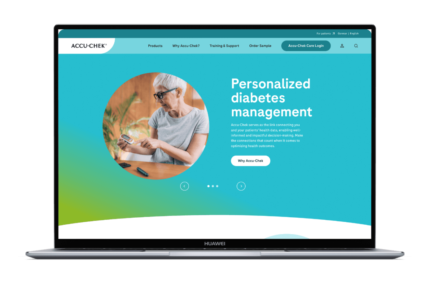

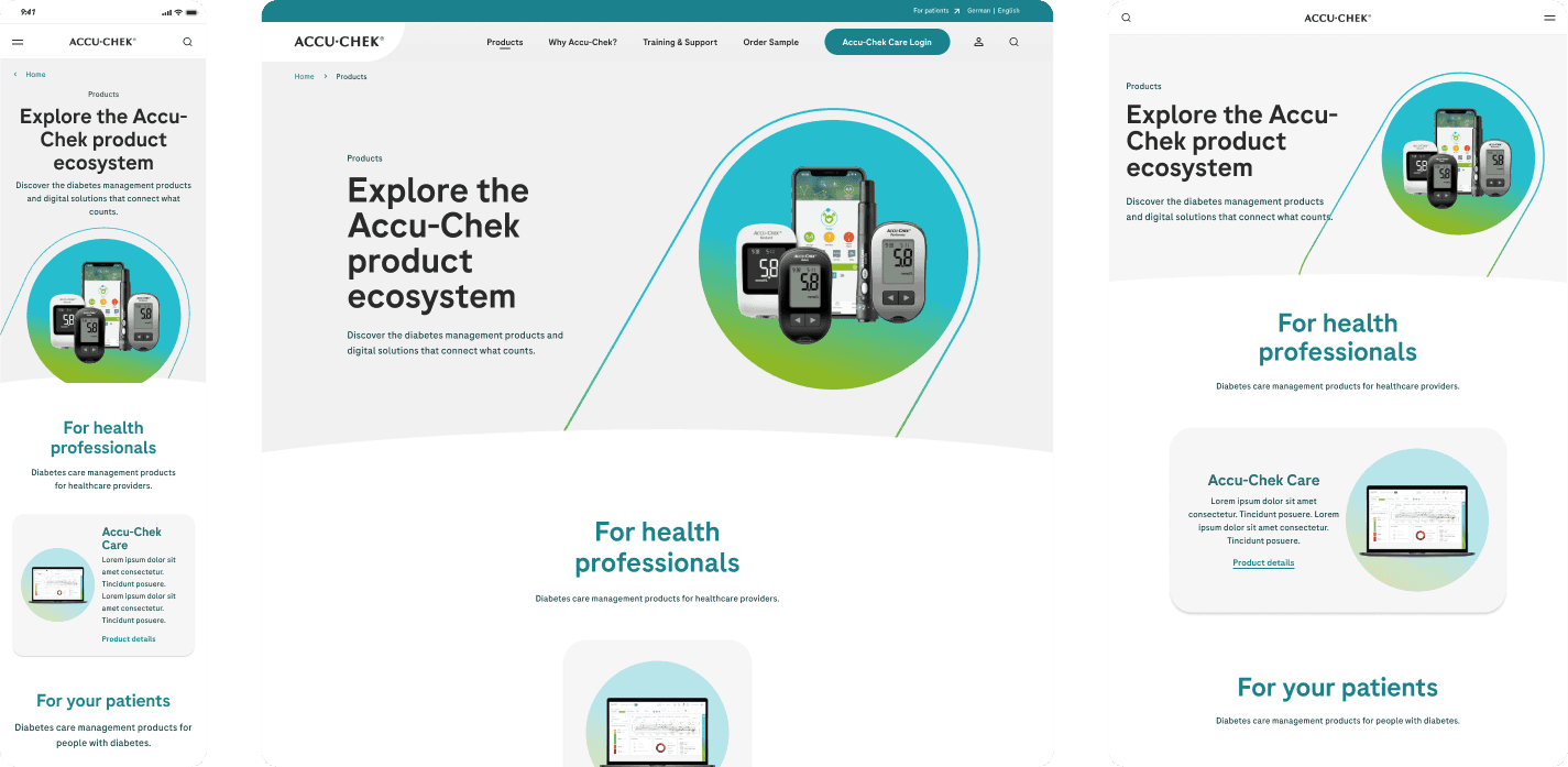
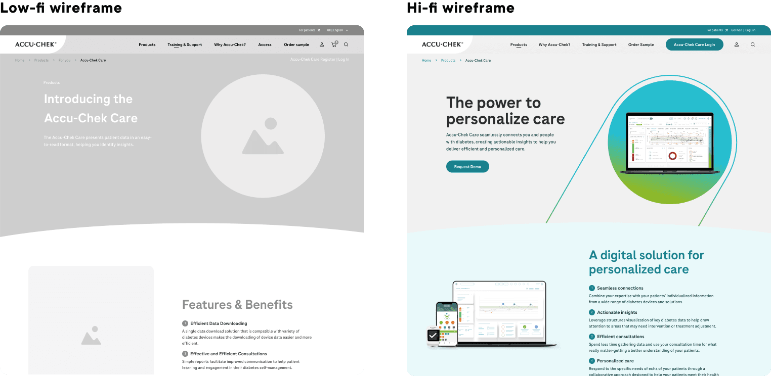
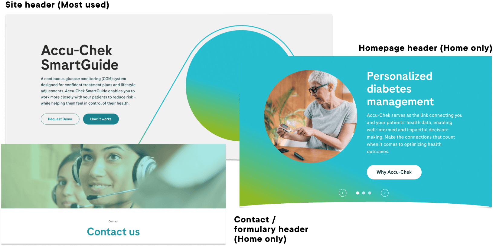
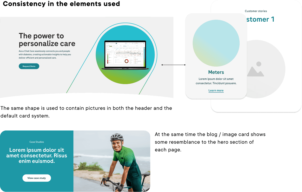
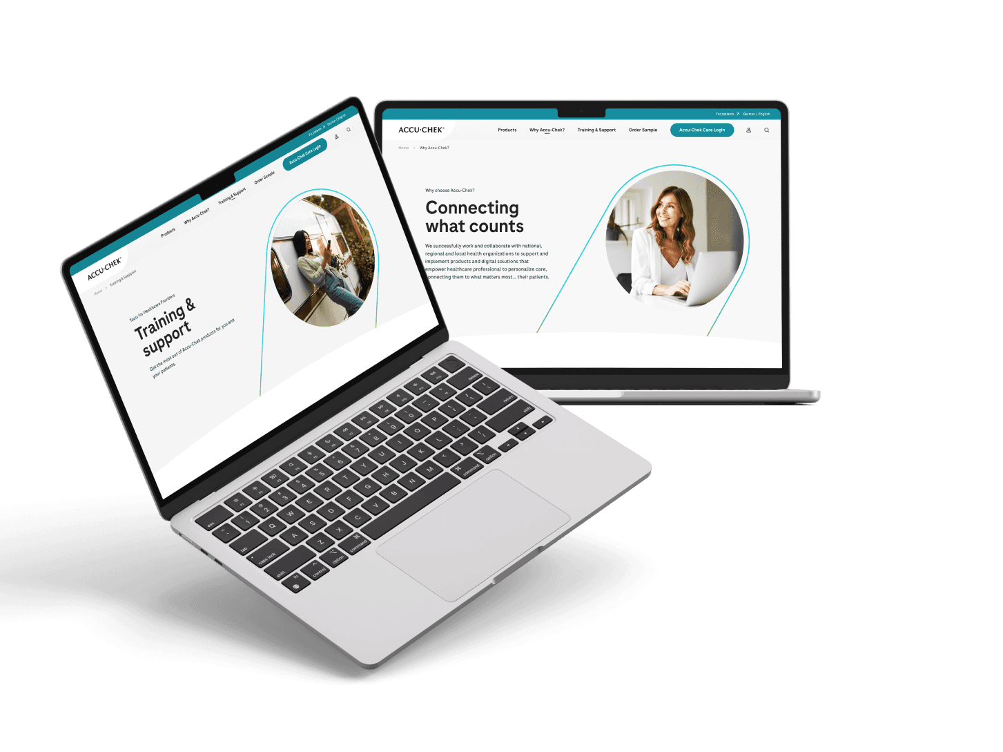
The design process at Roche went through several instances of feedback, iteration and revisions, not only to ensure that the product was as complete as possible but also to establish the foundations of competition, the proper use of established design elements and their correct integration. both with navigation and with the design of the other areas on the same site.
One of the main concerns when starting the project was to understand how other products in the field developed and showed their technological advances, while recognizing the lack of progress in this area to date. The existence of multiple sites, platforms and products led to the need to create a unified and clear space where information can be received, evaluated and used with ease.
Some of the more important findings were:
Easy contact with remote assistance
Dedicated information for both patients and professionals
Patient found by name, ID or filters
Training resources & user support options
Video tutorials for setup and use
In this step we definey the scope of the product, creating an MVP of most relevant and needed features. This will then be passed to every other part of the group, or in this case created alognside with them.
MVP
An MVP in Product Design is a Minimum Viable Product and it refers to creating the core features of a product. By defining the main features of a product, it helps teams prioritize its development goals and validate the product concept quickly with minimal effort and cost. This allows teams to receive feedback on the product early, identify issues or areas that need improvement, and stay focused on developing a product that customers will benefit from.
Clear and useful guides and FAQs
Reports easy to share & print, High Quality information
Patient list with name, tags and filters
HCP can modify pump settings
Separated tabs and sections, easy to navigate
Multiple language options.
Multiple data sharing / clear compatibility
Profiles for patients and HCP
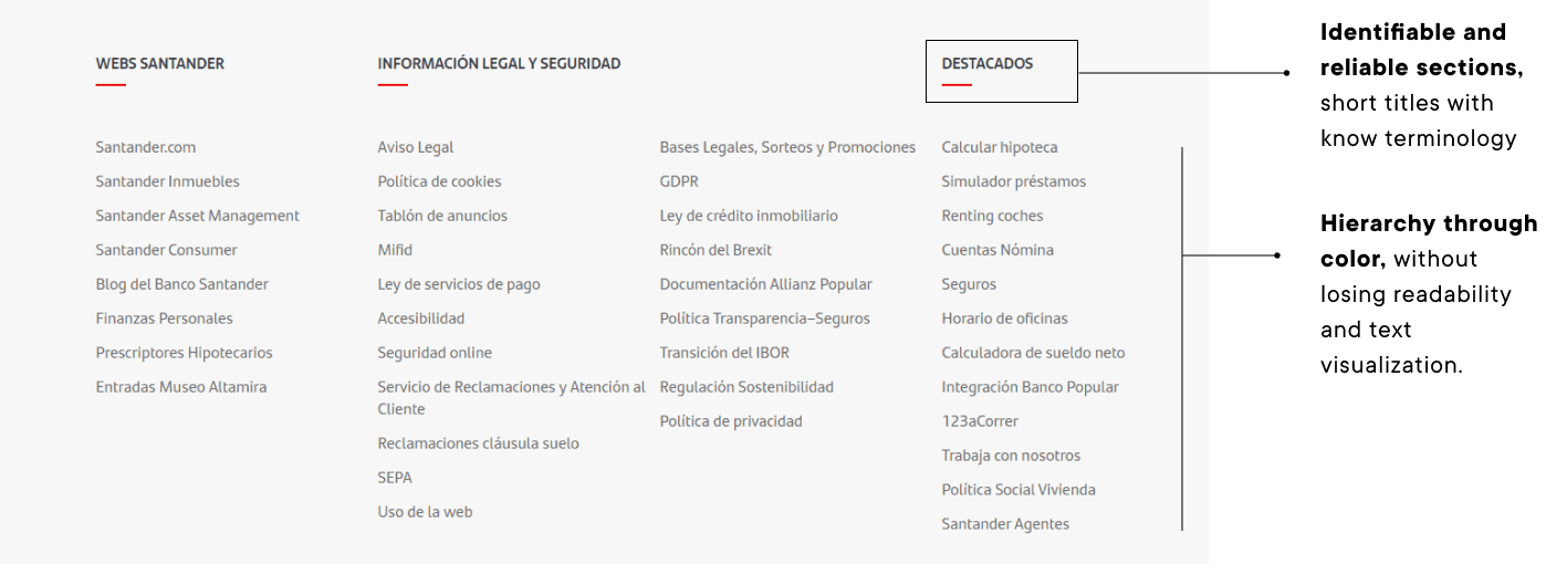
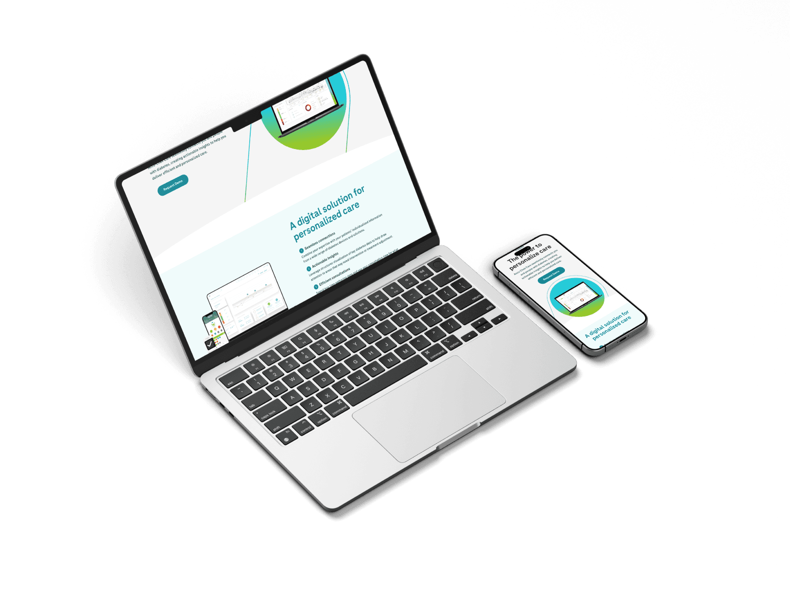
Multiplatform usage: made for both desktop and mobile view is important that the information the users dispose of is readily available whenever and wherever they need it, being a mobile, tablet or PC user. For this reason all pages are designed contemplating the three main breakpoints.
Information is key: The organization, divisions and pages focuses specially in the distribution of information, allowing users with all technological approaches to read and evaluate the information provided according to their profile - patient or healthcare professional.
Integration with an existing system: Roche and Accu-chek have not only an already stablished identity that needs to be respected when working in products related to them.
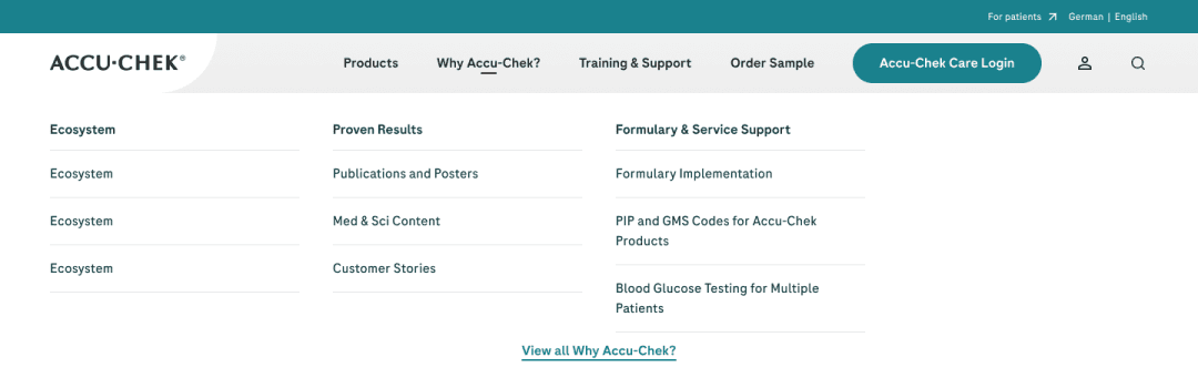
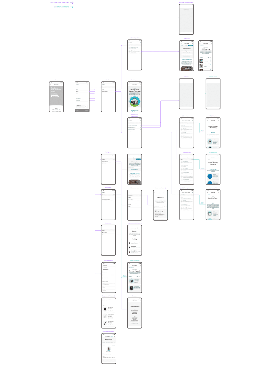
To mark the navigation hierarchies, in this case, a 'mega menu' was created where the necessary categories can be easily accessed. This format provides the ability to incorporate or remove sections depending on the needs of each site, taking into account that Roche's offers or properties in different regions may vary, with products enabled or products not available.
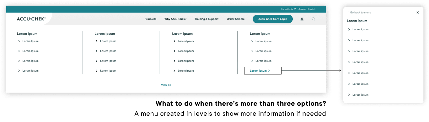
This iteration was mainly made from an scalable point of view, in a site that’s constantly expanding with new products and new information it’s crucial to be able to adapt and overcome any potential problem before it presents itself in the developing or implementation process.